Developing for early access
During GDC 2019, there was a talk which particularly caught my interest. Originally because it was a postmorten for the game Subnautica – one of my favorite titles – but most importantly because I realized how well the game had been doing in early access, and how well recieved it was. I had originally just thought of it as luck. Sometimes you just make the right thing at the right time, and the market carries you on. A harmful assumption, really, because it didn’t lead me to think further about the circumstances.
As it turned out, the team had not just been lucky – they had been adaptive. They understood what it took to satisfy and reassure their community, how to get them excited and leverage their enthusiasm to drive development further. They knew the value of word-of-mouth as an advertisement platform, how to design for a streamer-friendly game without compromising the experience. They ticked so many boxes correctly, it is no wonder they had such success. While there’s always some measure of luck involved, that can never happen if you don’t set yourself up to be lucky. With the aforementioned GDC talk, they gave an excellent summary of what they had done and why.
Before I get ahead of myself, I would like to point out that this post is a check-list of the points given in the 2019 GDC talk, with my own commentary on each point. All credit for the talk and developing the methods, befalls to Unknown Worlds Entertainment. The talk itself can be seen right here:
The link to the slides can be found right here:
The order of the topics I will go through, will largely follow the order they are presented in the video, but deviations may occur. Let’s get started!
Designing for emotion:
Right off the bat, the talk goes into iterative prototyping and how to tell if a prototype does what it is supposed to do. The core of this topic is to design for emotion:
If a prototype brings out an emotional response, try to hone on in why that happens. Becoming aware of these qualities and building the experience around them, is what will make your game memorable and fun.
Likewise, if a prototype fails to bring out an emotional response, be willing to move on and try something else. Don’t delete anything, it may be useful elsewhere, but do put it away and refocus on the things that work.
To exemplify the points above, during Subnautica’s development, they followed some key design pillars. But these pillars were not set in stone – should it prove that changing any of them would better accomodate for emotional responses, they would change. Here are the initial pillars:
- Blue Ocean Strategy (focus on uncontested marketspace – originality)
- Underwater Minecraft (Procedural generation)
- Survival sandbox (Don’t Starve inspired)
- Science Fiction
- No guns!
At this point, an excellent analogy was made. There are already a thousand indie games out there, like a sea of bubbles. If you want to have an impact, you need to be a “spiky bubble,” with the spikes being your core design pillars. The spikes will alienate some players, but other players will love it even more, so the equation has a positive sum.
The point being; don’t try to please everyone.
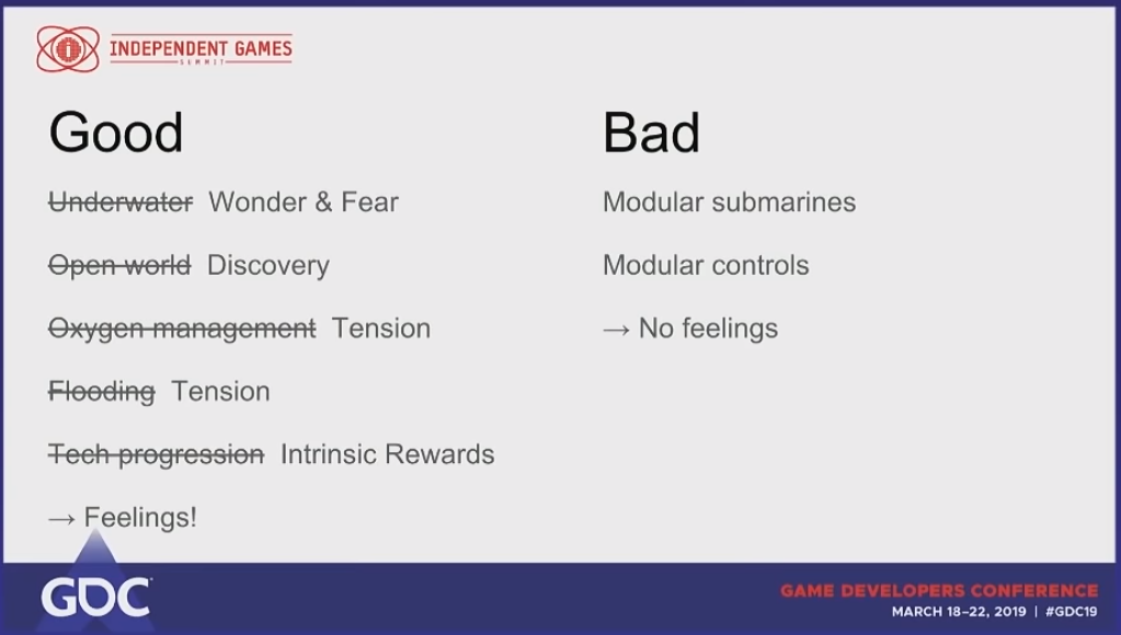
It is at this point in the talk that he brings up the iterative prototyping. They have not yet realized that they should design for emotion, but a few iterations made them realize what values they should focus on. While this differs from game to game – meaning I can’t give a concise checklist for this process, here is an image from when they realized that emotions were front and center:
A great benefit to this approach in regards to PR, is the appeal to streamers. Streamers are some of the greatest advertisers a game can wish for, but they seek out games which invoke emotional responses, because that is what entertains their audience.
Before I go to the next topic, I want to end the bit about emotional design and shelving prototypes, with an example that he brings up:
While the programming team was working on technical prototypes, concept art was being developed. The problem was just that none of the prototypes looked like the art provided. So to test the response to the art direction, the team hand-crafted a small environment to look just like it, and showed it off at PAX – without even putting a core game loop into it. The positive responses made them drop the idea of procedurally generating the environment, and stick to hand-crafting it instead. It also made them realize that people are scared of the ocean, so representing that aspect at a believable enough degree, has more of an emotional impact than anything they could procedurally generate.
Feedback and storage:
Beyond being aware of their design pillars, what the team behind Subnautica really did well, was understand the role of the community in their game’s development. It is one thing to search out feedback on your forums – that is practically mandatory for any developer today. It is something entirely different to build telemetry and feedback systems into your game.
I will list what systems were built for their game, outlining how they brought value, how we may create such systems ourselves and deploy them in different contexts.
The Feedback system is a way for each player to submit feedback to the developers, from directly inside the game. When pausing, there is a very clear option to choose from the menu:
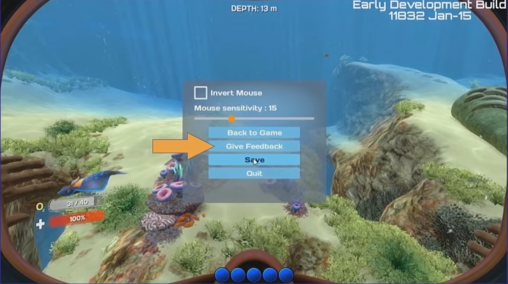
Clicking this option opens up the feedback window:

Notice the individual elements present here:
- A text field
- Categorization boxes (likely booleans)
- An option to include a screenshot
- A “smiley” as an emotional impact indicator (likely an enum)
Beyond what is visible to the player, there is a bunch of additional data associated with each feedback report. This is extremely important, because it creates valuable data to help guide development decisions going forward:
- Game world coordinate (position XYZ, orientation WXZ)
- Changeset (game version, I think?)
- Framerate
- OS version
- RAM amount
- GPU
- CPU
- Platform (PC, console)
All of this data is saved on a backend server, with an accessible query interface for the feedback tickets, looking like this:
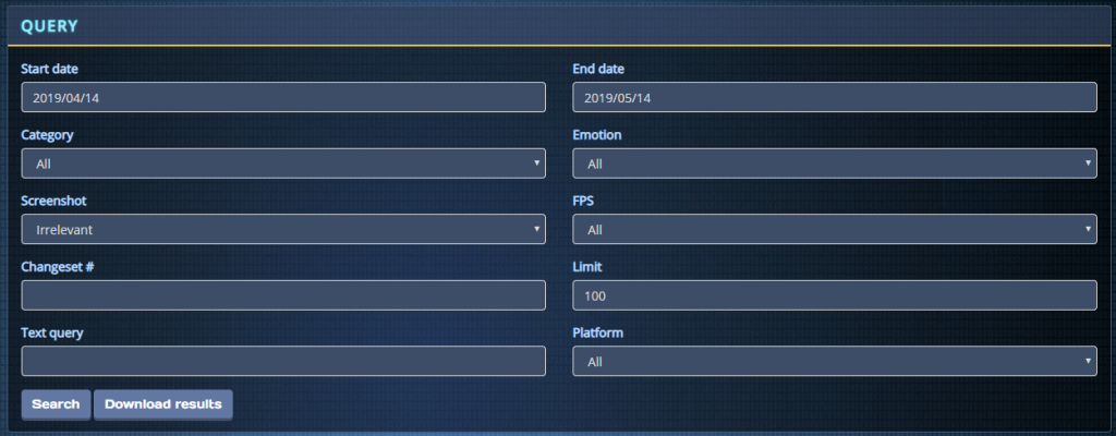
This query system illustrates a very important part of how the player telemetry should be handled. Due to the high influx of tickets, it is very hard to derive anything meaningful from simply shuffling through them one at a time. Instead it becomes possible to derive trends by entering a text query, alongside additional parameters to narrow the results. In the talk, Johan says they use it mostly as a dictionary that way.
It is possible to download the query as an XLS-file, which is how I reckon the information is stored on the server as well.
Telemetry and data analysis:
Which brings us to how this data can be analyzed in a meaningful way. It’s one thing to have all this data lying around, but a much bigger challenge to make use of it without losing perspective. I’ll return to the backend server in a moment, but first I’d like to take a look at some of the things that aren’t available to the public.
Above, I mentioned that the player location is stored alongside the feedback. This makes it possible to take a bunch of tickets and actually visualize – by using the emotional indicator on the ticket – where players had their happy or frustrating experiences:
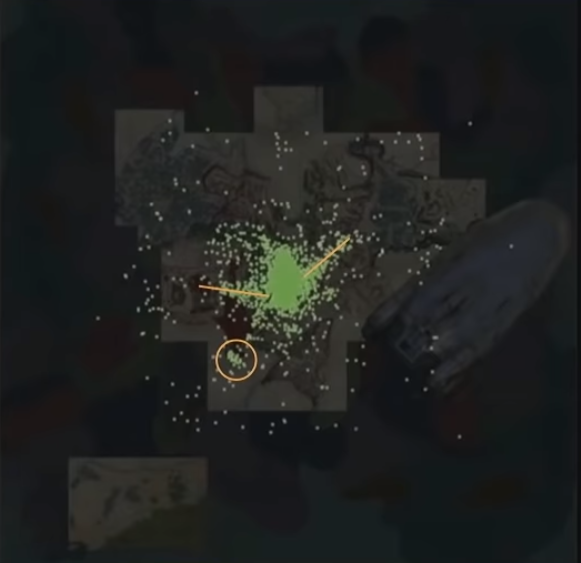
In this picture we see the a lot of tickets with the “happy” state, visualized on a map of the gamespace. This shows certain trends along the yellow lines, or at clusters such as where the yellow circle is, to indicate what parts of the game that the players liked, letting the team know what to do more of.
Likewise, you can imagine how this form of visualization for the “negative” state may show trends in certain regions, allowing the team to realize if there are problems that arise in specific areas more so than elsewhere.
Then there’s another “hidden feature” of the system – telemetry! At a set interval, if the player client is connected to the internet, it will send the player’s location in the world to a server. This is different from the feedback positions, because it helps show how players generally move, rather than being centered around particular elements. These updates can then be used to heatmap player movement like so:
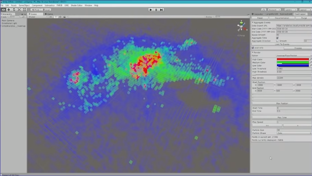
What we see here is what I believe to be a completely cube-shaped (or rectangular) grid of cubes. The positions stored in the telemetry database can then be visualized by translating the dimensions of the game, onto this map, incrementing some value for each cube in accordance to the number of coordinates landing inside of it. The shader on the cube then looks at this number to determine if it should be completely transparent (no coordinates), through blue, green and finally red at the most coordinates. The handy thing about using a grid of cubes, rather than trying to paint the landscape, is that there won’t be any coloured cubes where the players can’t access anyway, meaning that it automatically wraps the player boundaries, drawing the map inside the grid.
As is evident from the picture, there are particular trends. The red center is where the game starts, so that is a natural place for high traffic. But notice towards the right side, how there is a line of green. This showed the developers that players wanted to move towards a certain landmark in the scene:
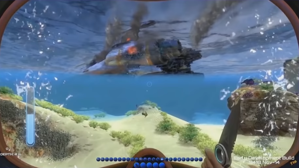
The problem was that it was just a billboard in the horizon – skybox, practically, as the game takes place underwater. So the developers added “radiation damage” to keep people away. The feedback showed that this simply made players want to fix it. Which in turn revealed how this could be made a tangible goal, which players naturally gravitated towards. Eventually getting radiation resistance and actually exploring the shuttle, became a central part of the game – all thanks to the players encouraging that content to be made, through their behaviour.
Returning to the backend server before I move on, one of the many tools which let the team gauge the reactions of these updates, is a summary of the emotional states of all submitted tickets each day:

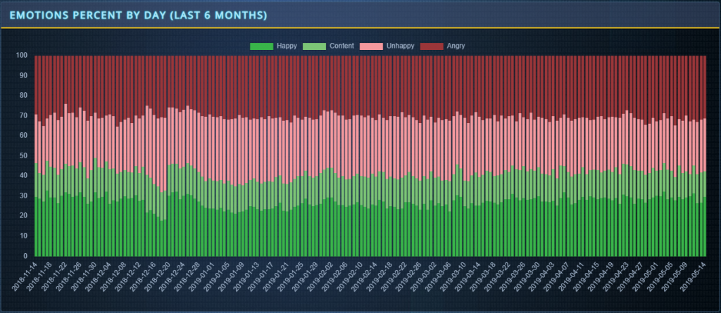
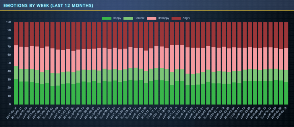
This makes it extremely easy to gauge whether an update has an impact on the emotions of the playerbase, which helps gauge if the changes have been positively or negatively received.
Finally, alongside the positional data of the players, each client would track and send the order in which each player would build anything in the game. The team is then able to tell if progression happens in the order they designed for. This works well for an openworld game where progression is non-linear, but may be less relevant to track if your game has more linear progression. Regardless, it seems worth mentioning.
Update perserverance, themes and transparency:
With all of these tools to drive development and gauge the reactions from the playerbase, one might think that a team is set. However, another important aspect of Subnautica’s development which caused its success, is how they approached their updates.
At one point during development, funds were running low. This forced the team to attempt to regain traction somehow. Returning to the “spiky bubble” analogy from earlier, this is when you need to look at what makes your game stand out, and do more of that. Using this perspective, each update was granted a theme and a headliner feature – like when the “Cyclops” submarine was added, or the “Reaper Leviathan” creature – each of these got their own update, themed to them.

And the updates were monthly.
It is important to add that not all features can be developed in a month, and for the sake of the health of your team, do not try to force this either. But do have something interesting each month. For the more complex features that take longer, set a team aside to work on those things. No one has to know that it took longer than a month when you do introduce those features.
It was tricky to keep adding new and interesting stuff each month, but by being aware of the central themes of the game and expanding upon existing systems, it was possible to create a roadmap following those principles:

And with each update, it is very important to talk about them. There are all the default channels to consider:
- Email newsletter
- Steam
- The game’s own website
With each update, there was also a small site on the website, with a little video showcasing the contents of the update (a method developed by Valve when working on TF2).
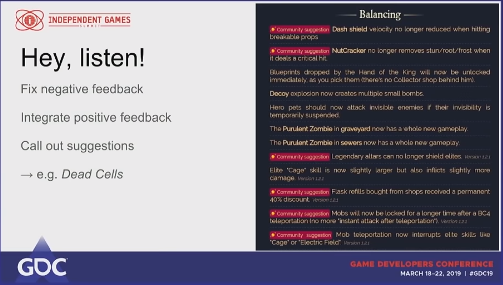
As a little aside, it was pointed out that this could have been done even better. Pointing to Dead Cells, a crowdfunded title, whenever a feature or bug was adressed, which came from community feedback, a little badge on that point would indicate so. This gives a great response, because the community can visibly see that they have an impact on the game’s development cycle.
One of the most important things that the team did in terms of transparency however, was opening up their Trello board to the public. Being a global team with almost everyone working remotely, it was necessary to coordinate everything online. Making this board visible to the public, gave an incredible level of transparency, as everyone could now see what the team were doing on a day-to-day basis. Additionally, a Twitter account was linked to the game’s version control system, so that any changed submitted would be posted on this account.
Which brings us to the part about free playtesters!
With this level of transparency, players can become as invested as they want, without actually being able to commit or change anything on the board themselves. But what’s even cooler is that the team submitted their daily builds to testing branches on Steam, so that anyone willing to play these updates – broken and buggy as they were, could do so. And people were playing them, because they felt like they had an impact on the game’s development, making them willing to participate even more.
In fact, here’s the distribution of players on Steam, across the different branches:
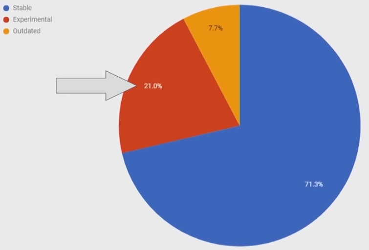
That’s free playtesting and that’s extremely powerful. This would not have been possible without this level of communication and percieved ownership.
Summary:
There’s quite a bit of stuff to take in here, but I think it can be summarized with a few overarching points:
Game design:
- Find your spikes – Design for uncontested marketspace, hyper-focus on the elements that define your game.
- Design for emotion – Every element of your game should invoke some kind of (desirable) emotional state. This makes for a fun experience and streamers love it.
- Kill your darlings – Get ready to throw out a prototype if it doesn’t support the point above, don’t get too attached to your initial ideas.
- Make feedback easy – If you want players to submit information, the process should be clearly available, easy and fast.
Data and analysis:
- Collect meaningful data – Both in feedback and telemetry, try to be simple but concise. The power in the data is not from the complexity of each submission, but how the submissions can be analyzed together.
- Build tools to utilize your data – Telemetry is a powerful thing. Think of how you can use it. Subnautica provides great examples, don’t shy away from copying those.
Community:
- Be transparent – The more people can look into the workings of your studio, the more they feel included in the product’s development. Don’t be afraid to show a lot of backend stuff.
- Emphasize on community impact – Highlight if changes and additions have been done, based on community feedback. This tells them that they have a voice.
- Themed, consistent updates – Build your updates around specific elements of the game. Follow a rigid release schedule.
- Open up for testing at all stages – Players love a broken mess, if they have opted into it themselves. The free playtesting is invaluable.